Text/Background Contrast
- Subscribe to RSS Feed
- Mark Topic as New
- Mark Topic as Read
- Float this Topic for Current User
- Bookmark
- Subscribe
- Printer Friendly Page
- Plusnet Community
- :
- Forum
- :
- Feedback
- :
- Community Site Feedback
- :
- Re: Text/Background Contrast
Text/Background Contrast
13-04-2012 1:08 PM
- Mark as New
- Bookmark
- Subscribe
- Subscribe to RSS Feed
- Highlight
- Report to Moderator
The contrast between the header bar and the "FORUM, SEARCH, etc. text is low and certainly doesn't meet the RNIB guidelines which must potentially cause problems for those with poor eyesight.
Re: Text/Background Contrast
13-04-2012 3:18 PM
- Mark as New
- Bookmark
- Subscribe
- Subscribe to RSS Feed
- Highlight
- Report to Moderator
Re: Text/Background Contrast
13-04-2012 3:23 PM
- Mark as New
- Bookmark
- Subscribe
- Subscribe to RSS Feed
- Highlight
- Report to Moderator

To argue with someone who has renounced the use of reason is like administering medicine to the dead - Thomas Paine
Re: Text/Background Contrast
13-04-2012 3:41 PM
- Mark as New
- Bookmark
- Subscribe
- Subscribe to RSS Feed
- Highlight
- Report to Moderator
Re: Text/Background Contrast
13-04-2012 4:21 PM
- Mark as New
- Bookmark
- Subscribe
- Subscribe to RSS Feed
- Highlight
- Report to Moderator
Can Pn take up this mild complaint and put moreContrast into the website please...
Later I even find it hard to see this contrast I put in the letter!
In fact I think that the whole setup of the page is far too bland...let's have something bold please!
Re: Text/Background Contrast
13-04-2012 8:57 PM
- Mark as New
- Bookmark
- Subscribe
- Subscribe to RSS Feed
- Highlight
- Report to Moderator
http://www.rnib.org.uk/professionals/webaccessibility/lawsandstandards/Pages/laws_standards.aspx
It is about time that the marketing experts who seem to decide on the colour schemes are told in no uncertain manner that they must conform to UK Law
Quote UK Law
It has been a legal requirement for UK websites to be accessible since 1999. Since then all websites have been expected to make "reasonable adjustments" to ensure their websites accommodate all users regardless of ability, disability.
Re: Text/Background Contrast
16-04-2012 11:20 AM
- Mark as New
- Bookmark
- Subscribe
- Subscribe to RSS Feed
- Highlight
- Report to Moderator
Sorry about that, I've just checked with the web team and the header that's there is a temporary measure. The proper new one (which will have contrast) is being designed now and should be up within a few weeks at the latest.
Re: Text/Background Contrast
16-04-2012 6:24 PM
- Mark as New
- Bookmark
- Subscribe
- Subscribe to RSS Feed
- Highlight
- Report to Moderator

I thought we were complaining about the background and the lack of visibility????
Re: Text/Background Contrast
16-04-2012 6:28 PM
- Mark as New
- Bookmark
- Subscribe
- Subscribe to RSS Feed
- Highlight
- Report to Moderator
Re: Text/Background Contrast
16-04-2012 6:35 PM
- Mark as New
- Bookmark
- Subscribe
- Subscribe to RSS Feed
- Highlight
- Report to Moderator
that is for me very disappointing.
I have difficulty in READING the actual questions and answers
I'm not too bothered about the header.
I thought I had explained my problem earlier but it seems not taken up...
Re: Text/Background Contrast
16-04-2012 7:50 PM
- Mark as New
- Bookmark
- Subscribe
- Subscribe to RSS Feed
- Highlight
- Report to Moderator
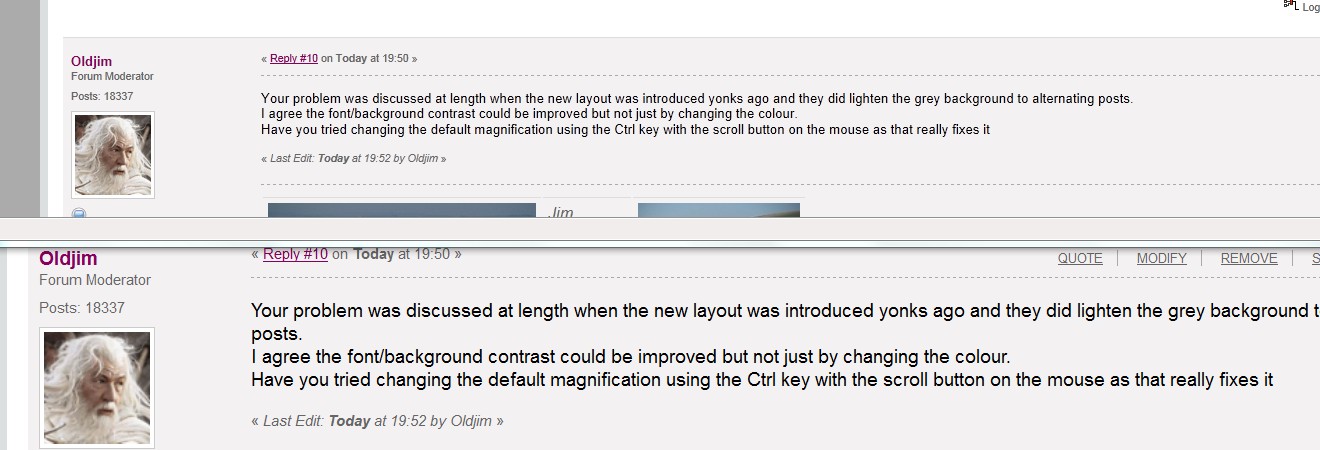
I agree the font/background contrast could be improved but not just by changing the colour.
Have you tried changing the default magnification using the Ctrl key with the scroll button on the mouse as that really fixes it
This show the before and after
Re: Text/Background Contrast
17-04-2012 7:36 AM
- Mark as New
- Bookmark
- Subscribe
- Subscribe to RSS Feed
- Highlight
- Report to Moderator
That's IS an improvement which I can live with.
I would still like not to have to do that every time.
In my opinion, the real answer is to have the facility to change to a selection of background setups as in other Forums I frequent.
Have a look at this one.
Scroll to the bottom left and click the white box. You can change the background to more choices.
http://www.synthzone.com/forum/ubbthreads.php/forums/
Re: Text/Background Contrast
17-04-2012 9:45 AM
- Mark as New
- Bookmark
- Subscribe
- Subscribe to RSS Feed
- Highlight
- Report to Moderator
Re: Text/Background Contrast
17-04-2012 9:49 AM
- Mark as New
- Bookmark
- Subscribe
- Subscribe to RSS Feed
- Highlight
- Report to Moderator
As Jim says this was remembered by FF and I still come across the odd site that I visited that I have to reset with Ctrl 0.
To argue with someone who has renounced the use of reason is like administering medicine to the dead - Thomas Paine
Re: Text/Background Contrast
17-04-2012 10:17 AM
- Mark as New
- Bookmark
- Subscribe
- Subscribe to RSS Feed
- Highlight
- Report to Moderator
- Subscribe to RSS Feed
- Mark Topic as New
- Mark Topic as Read
- Float this Topic for Current User
- Bookmark
- Subscribe
- Printer Friendly Page